T-Mobile Subscription Marketplace
web_asset Webpage
T-Mobile wanted to position themselves as a seller of subscription services, such as Netflix, Spotify, or Tidal, in addition to their normal telecom providings. The Subscription Marketplace was their first ideological foray into having a marketplace entirely separate from their normal services where users could buy, bundle, and manage their subscriptions in a single place.
Problem
The way T-Mobile sells subscriptions was unintuitive for users. In order to upgrade their Netflix, or pick up a new service like Quibi (may it rest in peace), users needed to dig deep into account management to a page called Manage data and add-ons. This page served as a catch-all for the miscellaneous features that didn’t fit T-Mobile’s typical telecom focus. The product and technology team felt it was time for a new, separate marketplace dedicated exclusively to this type of subscription service to help alleviate some of the development pains that come from inextensible solutions.
Troubling origins
The way this project came about was atypical, and not very user-centric. Normally this is the kind of project I'd avoid showcasing on my portfolio, but I’m showcasing it anyway because 1) I believe the slice of UX work I did was still quality and 2) examples of technology-lead projects are prolific in the industry, and UX designers still need to operate in these conditions. I will by no means say technology-first product design is the correct way to build products. It is not.
Solution
A story you hear time and time again in the UX industry is that our precious data-informed foundation was ignored due to hurried deadlines, unclear objectives, or in this case, a problem emerging from a solution instead of the other way around.
This was just such project - an entire e-commerce flow from marketplace to checkout, in high fidelity, with a single week's time for a first draft. This was a level of restriction I wasn’t used to, and the scope was vast. There was no time for digging into user data, creating personas, or journey maps. I was able to negotiate for some time to do usability testing, though – so in the absence of everything else, at least we could validate the concepts with users with a prototype and some survey questions.
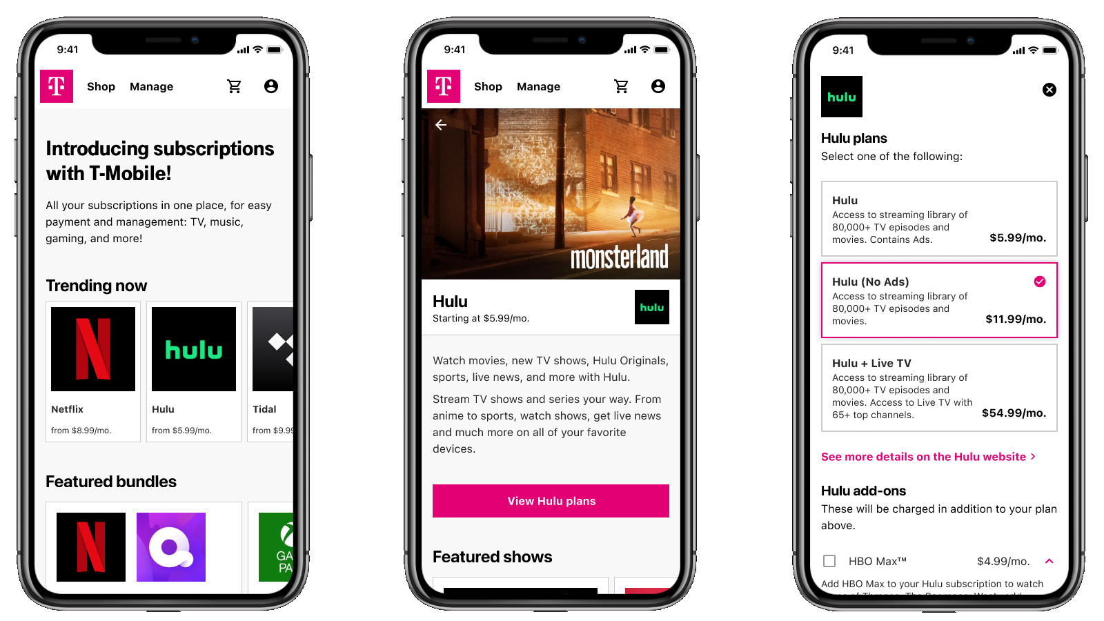
Mobile Prototype
The product team came to me with a set of requirements, so I was able to launch into UI mockups fairly quickly without needing to reduce ambiguity. The question of whether we were building the correct product for the user was a different than whether I had enough clarity to begin.
As part of validating our concept with users, I put together two medium-fidelity mobile prototypes and worked in tandem with a usability vendor. We did an unmoderated test with 10 participants. The test design was done by the vendor, though I had input on the questions asked and tasks performed.
View the prototype here!
The results were revealing: users didn’t seem to understand that this service was separate from the regular T-Mobile telecom offerings. Most assumed you’d need to be a T-Mobile customer already in order to utilize the service. In fact, one user in the study actually closed the prototype and went directly to the Hulu website to sign up, thinking she couldn’t use SMP as a Verizon customer.
The survey questions in the test that let me grasp some of the background knowledge that I had been missing prior. Common subscription headaches were keeping track of payment dates, making sure payment methods weren’t expired, and making sure funds were available. If I had a chance to iterate, these were things I could focus on.
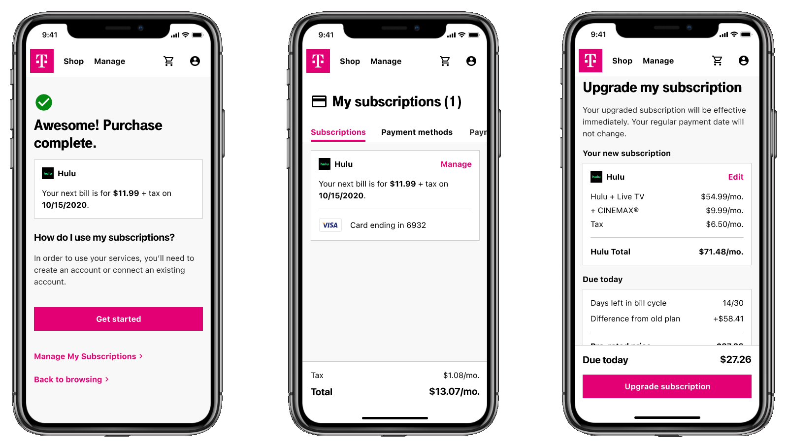
Both tasks – purchasing a subscription, and then upgrading it – were completed by 80% of users. There was some failure to establish the correct conceptual model, though: buying a subscription through T-Mobile was a two-step process. First you must buy the subscription, then you must visit the partner site and link your accounts. Most people got through the first step. Fewer got through the second.
To cart, or not to cart?
One point of discussion with stakeholders was whether or not to use the cart paradigm – an e-commerce staple - for subscription services. The digital cart is analogous to the carts in a physical store. However, a subscription marketplace holds a difference in that the services you’re buying are recurring charges, rather than items you buy once. In this case, does a cart make sense? You are “buying” the service again every month.
My initial thinking was no, and I cited the app stores present on iOS and Android devices – these storefronts only allow a single purchase at a time. Would SMP customers behave in the same way?
The user study pointed out that users don’t often make changes to their subscriptions after initial purchase– kind of a ‘set it and forget it’ situation. SMP isn’t necessarily analogous to the Play or App stores, either, because it isn’t always at your fingertips, and users would rarely come back to visit. Ultimately we decided to use a cart to allow multiple purchases at once in order to better fit the user behavior, and because we could repurpose existing code from the main T-Mobile site.
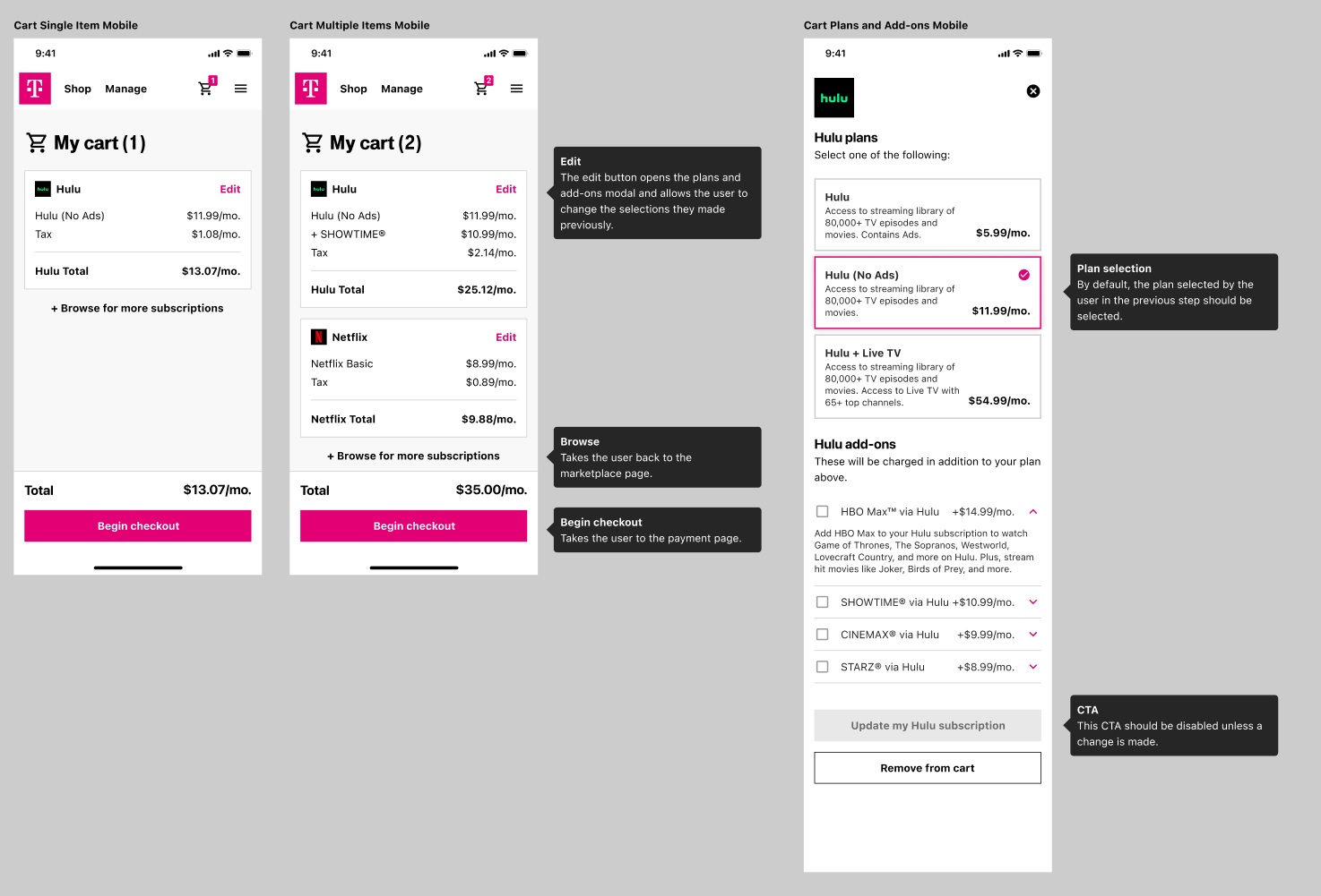
Documentation and hand-off
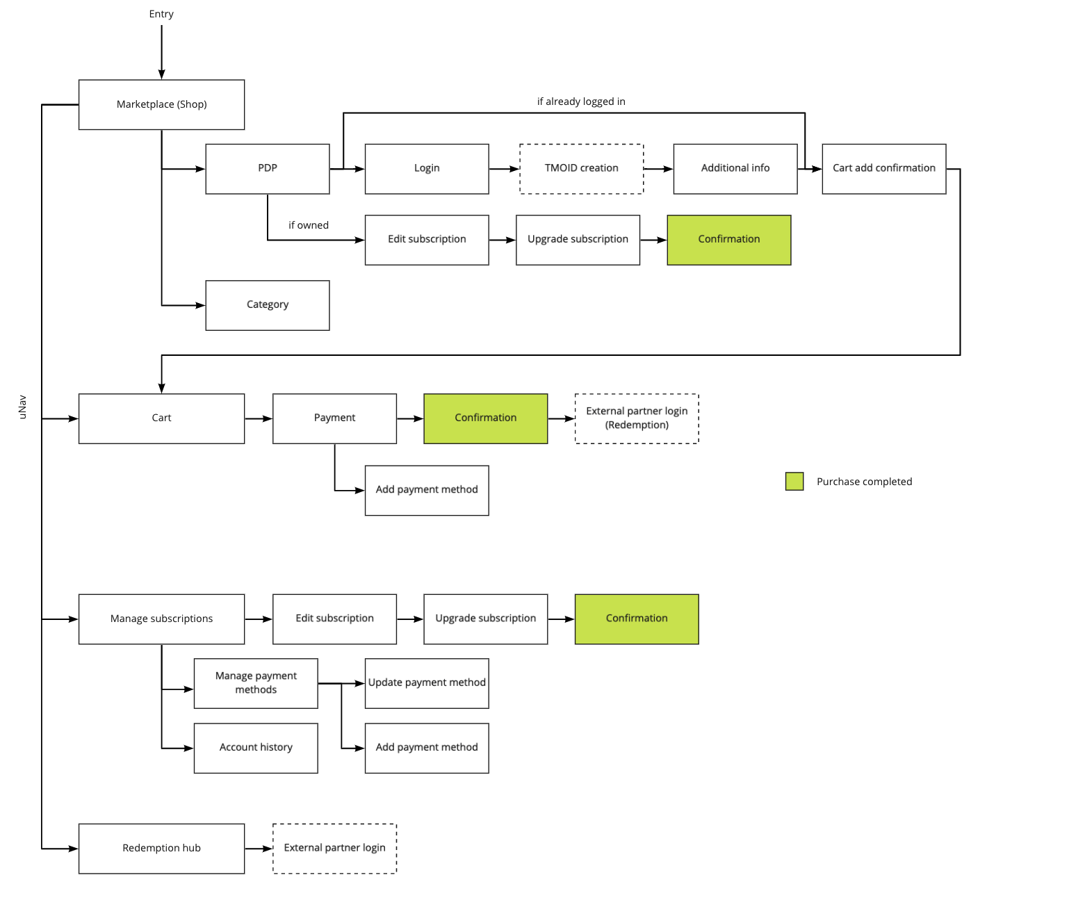
To build any UI correctly, designers should work closely with engineers to make sure every nuance is understood. Part of my method for doing this is detailed notes. Fortunately, most modern design tools automate the redlining process, so assuming high-fidelity designs are done pixel perfectly, there should be no need for the manual spacing indicators that were so time consuming in the early 2010s. When detailing behavior (like “What page does this button lead to?”) I think it’s important to include better instruction. Below you can see some examples of my UI documentation for SMP.
Product market fit
My involvement with the Subscription Marketplace proof-of-concept ended before development was completed. After the designs were delivered, the development schedule was repeatedly delayed, and research revealed there wasn’t much of a consumer appetite for the kind of service SMP was providing. The common question users had was “Why would I use it over just buying the subscriptions individually?”
There was no good answer. The project was put on hold indefinitely. This story serves as testament that focusing on users is the correct way to build products – much time could have been saved if we had realized the concept wasn’t viable from the beginning. Don’t build backwards from a solution and expect a problem to arise.
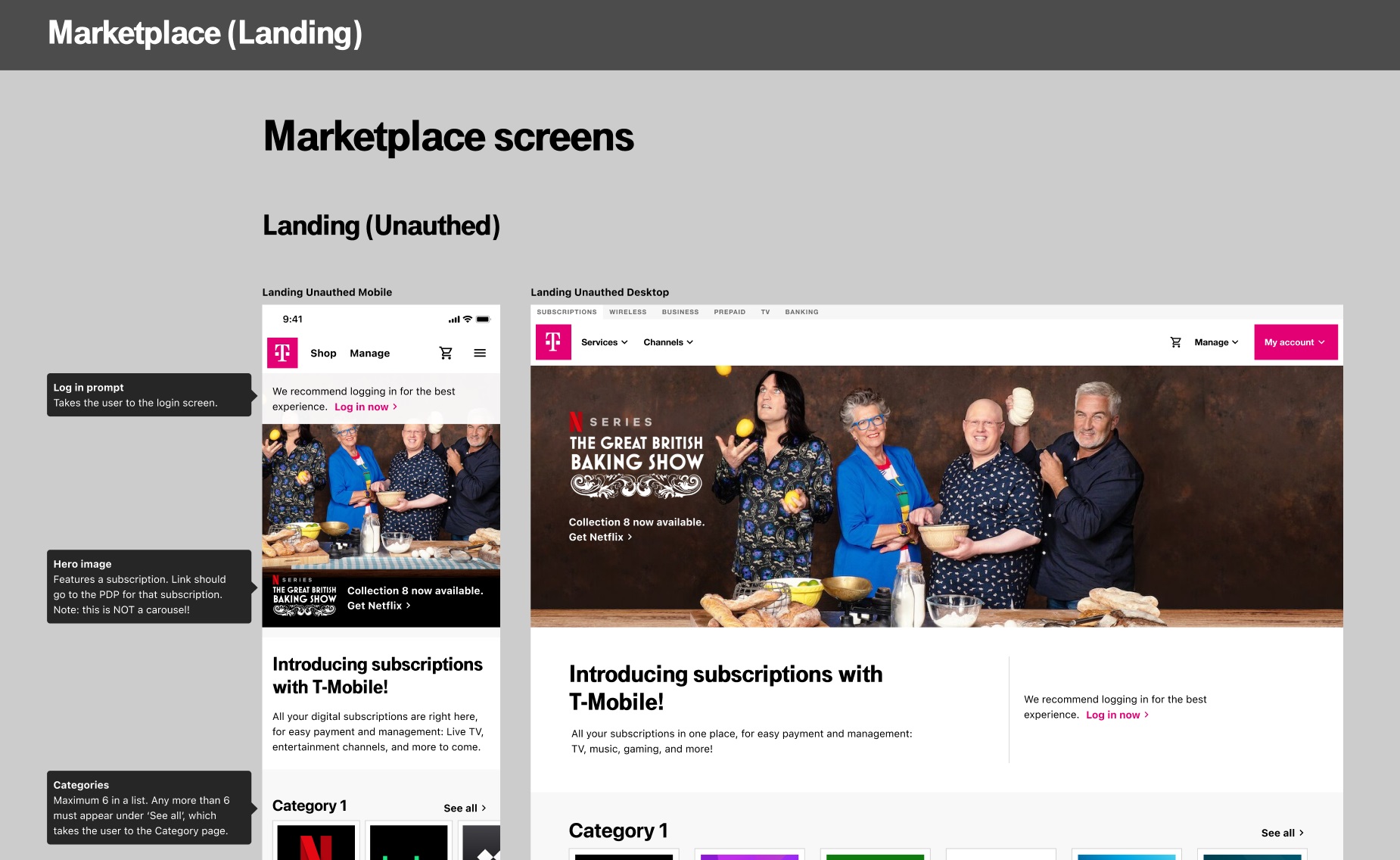
More screens
Here are some more examples from the project.